More Than Meets The Eye: DC Comics New Logo

Despite the fact that many fans are telling them to peel and stick it, DC Comics/Entertainment have recently unveiled yet another new logo design, this time created by Landor & Associates, a San Francisco-based global branding consultancy.
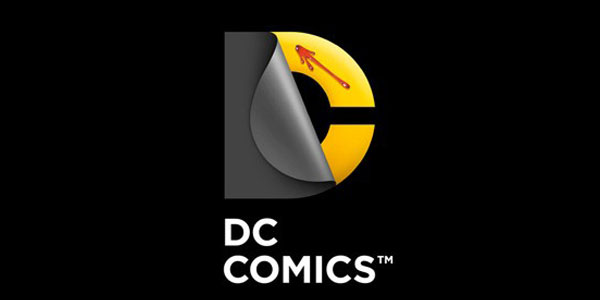
![]() With its peeling “D” revealing a static “C” underneath, the new logo has been described as “symbolizing the duality of the iconic characters present within DC Entertainment’s universe.” Um, okay. It’s certainly different from its predecessors. Nicolas Aparicio, executive director at Landor’s San Francisco office, says, “the new identity is built for the digital age, and can easily be animated and customized to take full advantage of the interactivity offered across all media platforms.”
With its peeling “D” revealing a static “C” underneath, the new logo has been described as “symbolizing the duality of the iconic characters present within DC Entertainment’s universe.” Um, okay. It’s certainly different from its predecessors. Nicolas Aparicio, executive director at Landor’s San Francisco office, says, “the new identity is built for the digital age, and can easily be animated and customized to take full advantage of the interactivity offered across all media platforms.”
If it doesn’t seem that long ago to you that DC reinvented its image, you’re right. Barely seven years ago in 2005 DC rebranded itself with a design created by Josh Beatman of Brainchild Studio (the “DC Spin”), and that logo was itself replacing one designed in 1976 by legendary graphic designer Milton Glaser (the “DC Bullet”). In fact, DC has been tinkering with its own logo design off and on again for the last 42 years, and to varying degrees of success if you listen to the fan grumblings. What’s the official moniker of the latest logo incarnation? Well, “the DC Peel” seems to the top contender for a name so far.

Generally speaking, when done right, logo design makeovers can inject new excitement into a longstanding corporate brand. A logo that seemed fresh and cutting-edge even 10 years ago can look old and stale to today’s audience. Sensibilities and styles change with the years, and no one selling to a modern demographic wants to look old-hat. Major corporations may choose to redesign their logos when they change their market focus and most especially when they plan to expand into new markets. Rebirth equals growth and growth equals more profit to most corporate eyes, but too many changes made too often can make a company look a little erratic, if not capricious. Change for change’s sake rarely pays off in customer loyalty. There has to be a real need for a complete redo of a brand. And DC seems to feel that they have plenty of good reasons to reveal a new identity at this time.
Opting to go all out for a logo makeover rather than just a wash-and-brush-up job indicates that DC is planning to use the adaptability of their new look to great advantage in a host of ways beyond the traditional print, television and film markets. “We didn’t want a static logo, but a living identity that could capture the power of our characters and storytelling,” says Amit Desai, senior vice president of franchise management at DC. Thus we can expect to see this new “living logo” making an interactive appearance on an ever-increasing array of digital devices, including smartphones, tablets, touch-screen displays, and gaming consoles. “In addition to flexibility, the new logo communicates this idea of dual identity,” adds Desai, “There’s more than meets the eye. You have to take a closer look to understand the richness of our characters and stories.”
Given that the new logo is a big departure from what came before, one has to expect more than a few squawks from its intended audience. Speaking as a graphic designer myself, I’ve decided that I like the new “peel” look precisely because it’s so different from past symbols. True, I was a bit disconcerted at first, after all, this is not your grandpa’s DC logo, is it? But I find that this new logo’s very adaptability, and the ability to personalize it to each individual DC character, is an appealing concept. I like the boldness of the font used (not coincidentally called “Gotham”, I’m sure), and feel it proclaims stability as well as giving a slight nod to the past in style. Then once I saw the multitude of ways in which the logo could be adapted I fell I love with the idea of its unbounded versatility.

Whether the newest DC logo concept signals a true rebirth for DC Comics and DC Entertainment doesn’t seem to be in question. One thing is sure, DC’s decision last year to reboot and launch “The New 52” comic book line with its new number one stories, new costume designs, and new origins for characters, and now the unveiling of a new corporate branding logo that hopes to encompass the digital age and beyond, are probably just the beginning of a major reinvention of one of the largest and most successful companies for comic books and media.